The president flunks it. Hey, that’s probably why he doesn’t want to show us his transcripts. Anyway, he was probably told there would be no math.
And this graphic should be shown every day until the first Tuesday in November.
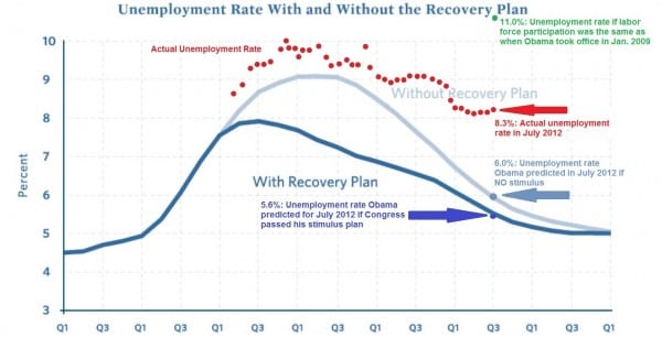
Because the message is that Obama and his economic team didn’t know WTF they were doing then, and they still don’t. That’s generously assuming, of course, that their goal actually was to grow the economy, and not just hand out our grandchildrens’ money to their cronies and political allies.
Rand, I guess you are not one of those over-salaried over-pensioned university professors worried about getting papers through peer review. That graph needs serious revision.
The “With Recovery Plan” label should actually be in red and placed up at the top next to the real-world data of the red dots. The Actual Unemployment Rate is what we got with the “Recovery Plan” in place. The “With Recovery Plan” label in what you have should instead read, “Rosy-Scenario From Those Weenie Harvard Economists and So-Called Financial Experts on the Obama Economic Team.”
“Without Recovery Plan” is matched in color to the prognostication from the same weenies of what would have happened without following their advice. But you should never rely on color in a figure. If you were an over-salaried over-pensioned university professor, you would know that color results in stiff publication charges that come out of your grant or out of your own pocket if you are “between grants.” But the “Without Recovery Plan” label is smack dab in the middle of the red dots, and when published in grayscale, or perhaps to the casual reader, it will look like “Without Recovery Plan” has the worst-case happening in the absence of the Recovery Plan, which is opposite from the point you are trying to make.
Seriously, Rand, you should consider graduate school. I could probably get you a TA post; the salary is quite low but it pays a living wage out here in Cow Country and it includes a good health insurance (for now). Being a native speaker of English and your experience in aerospace is a plus. That we are a taxpayer-supported public institution and not Harvard means we offer better quality. And if you worked under my supervision, I would train you in making better graphs.
It is fine to publicize “the education bubble” and how a person can do without the work product we supply here. But you probably don’t want to draw attention to the consequences of doing without.
Paul, getting bent out of shape over the presentation of the data may be something that a professor does, but most of us are just thinking about what the data says. And those of us who don’t work for the government mostly like it that way, despite the lack of benefits and “job security”.
And some people on the Libertarian/Conservative/Right Blogosphere are too earnest to get a joke.
But seriously, that graph with its faults has meaning to the circle of people around here. But it has serious enough flaws to have it communicate the wrong political meaning to the casual viewer and independent viewer we are trying to reach.
And the snarky resentment expressed towards persons in STEM disciplines who could have pursued an industrial or entrepreneurial path but are instead in public service employment is increasingly common, not just here but everywhere on the Libertarian/Conservative/Right Blogosphere.
Politics is about building coalitions of people with differences but sharing enough in common to work towards a common goal. I see the Libertarian/Conservative/Right Blogosphere drawing an ever narrower circle around itself with the 2012 elections looming. I see the Richard Fernandez blog, which had focused on the terrorist enemy overseas somehow shifting its focus to public school teachers conducting demonstrations in Wisconsin as being the “enemy.” So there is this Australian blogger of Phillipine origins who has a guilt complex for having sat out (in Belmont, Massachussets, hence “Belmont Club” as the blog name) the dangerous times of riding the homeland of Mr. Marcos, who thinks that the sentiments of public school teachers in Wisconsin rise to the level of an International Crisis?
OK, Philippine.
Paul, the point you may be missing is that this graphic is simply the original chart put forward by the administration to support the stimulus with the subsequent real-world data over-plotted. Reformatting the plot may make things clearer, but it loses the impact of showing the actual results directly over the rosy scenarios. People who have been paying attention have been seeing versions of this chart since the first few months after the stimulus was passed. It is just getting a little bit wider play now.
But it is not the original plot put forth by the Obama people. That would have to be the two greyish traces of the prognostications of “With” and “Without” the Stimulus. The red dots (and the one lone green dot) are not something the Obama people want to draw attention to in comparison with their original figure and I kind of doubt the complete graph came from them.
Mr. Milenkovic, I for one appreciate your arid, Kaufman-esque delivery. As a fellow, I say, “well done.”
That settles that. Looks like Paul won the comments for the day. Tshirt is in the mail.
“I am not a crack-pot!“
I would suggest that you take your complaint to the person who actually created the graphic.
American Revolution-style plaigarism!
Oh, and the green label and lone dot “11% Unemployment rate if labor force participation was the same as when Obama took office” is completely confusing without knowing the context of the recent growth in number of persons who have dropped out of the labor market owing to tough economic times and don’t even show up in the statistics. I would have missed that important point entirely if I didn’t give the graph another serious detailed look.
A person shouldn’t be so lazy in presenting that graph without crunching the numbers to show a green-dot trace, showing that statistic as a plot given equal consideration to the other three plots.
As I said, we teach this here at the “U.”
That would be a really good addition
Since Jim hasn’t weighed in, I’ll do it for him and say that this is obviously nonsense as the following proves conclusively:
http://www.linktosomebullshitgraphinMotherJoneswhichdoesntmeanwhatJimthinksitdoesanyway.com
Hey that link doesn’t go anywhere :*(
That makes it even more authentic…